Tuesday 4 November 2014

Final Posters


This is the final poster for the Freak Show season. I changed quite a lot of it from the mock up I had created. I decided to get rid of the clowns face and just have his smile, and nose placed on the background, this allowed me to have him placed in the centre and be able to place font around it. I added a sort of sketched style to the nose and the smile to give them a sort of rough and distorted look. For the teeth I removed the 3D effect and feel they look much better in 2D and actually stand out more. I felt the original background was too light and bright so I made it a very dark colour, almost black. I think this makes it look more creepy as the teeth and nose realy contrast and stand out. I was going to use the american horror story font but thought it looked better by using the same font for both bits of text and making them suitable for the genre and style of the season. 


This is the poster I made for the Asylum season, it's not much different from the mock up. I just added a few textures to the nuns faces, giving them a static look, and used a scratched look on the inverted cross used for the eye to make it look like it was cut into the nun. I used a grainy look for the background and made it darker. I really like the scratched font and like how it matches the cross. On both posters I added the names of the creaters of the show on top and put 3 of the main actors names on the bottom. I'm really pleased with how these have turned out and think that they match both Saul Bass and Horror genre style.

Monday 3 November 2014

Poster Mock Ups


This is my poster mock up for the season Freak Show. For the 'American Horror Story' font I went on Dafont.com and found the font that most looked like the actual font they use for the TV show. I warped the font in Illustrator to give it the kind of wave effect. I wanted to do this to see how the font would look like in a different form. I decided to include a different font for the 'Freak Show' text, as the show is set in the 50's I found a font that was a similar style to old fashioned font that would have been used then. I stretched the font  Vertically to make it taller. For the image I decided to use Twisty the clown that has been used in the show from the first episode. To show that he was evil I thought it would be a good idea to give him an evil smile, I was able to create this by using very sharp, pointy teeth. I'm really pleased with how this has turned out and think I was able to achieve the Saul Bass style without losing the American Horror Story style.


This is the second poster I created, it is for the same show but a different series which is based in an asylum. As the asylum is run by the church, there is a lot of nuns used throughout the season and one gets possessed by the devil. To show the different nuns I decided to include one good one and the one who gets possessed. To show the one was possessed I thought it would be good to use the Anti Christ sign and give her an Inverted Cross for an eye and even made it red to show danger and fear. I like how there isn't much difference between the two but the little detail is able to show that something is wrong with the one on the right. For the font I used the American Horror Story font, much like the first poster to show that they belong to the same franchise. For the Asylum font I wanted to find a creepy/scary font. I like the scratched effect on the font I chose. To edit the font I compressed it so it was shorter and wider than it originally was so it would easily in the space available without overlapping the nuns. I'm really pleased with this poster and think I was able to keep both the Saul Bass style and the American Horror Story style. 

Friday 31 October 2014

Freakshow poster thumbnails

These are some thumbnail poster designs I came up with for the freakshow series. I tried to use different characters and objects in each poster, and tried to create something that hasn't been done or seen before. I really like how these have turned out and think they all work well but don't give too much of the story line away. 

Asylum poster thumbnails

These are some quick thumbnails i created for ideas for the poster I will be making for the show. I tired to use different objects and characters in each poster and tried to create things that haven't been seen before. I'm pleased with how these have turned out and have a good idea of what sort of theme and style I will be using for the actual poster.

Freakshow objects ideas


I decided to use all characters for this so decided to draw the evil clown that is shown in the series, I liked the evil theme so decided to try use a jester and make them evil aswell as they fit the horror side and the fun fair theme. Jimmy is one of the main characters so decided to draw his hands as they are deformed and the audience would be able to tell who it is. Elsa is the woman who owns and runs the freakshow and is known for her over the top makeup so it thought it would be good to draw someone with over the top makeup.  One of the most interesting and unique characters is the two headed twins so had to use them as they are unique to the show. I decided to use the bearded lady which is typical for freakshows but as she's old in the show, I decided to make a younger version of her.

Asylum object ideas

These are some ideas I have come up with to use for the poster for the Asylum season. I drew a nun because they run the asylum, then drew a nun with inverted crosses and sharp teeth as one nun gets possessed by the devil. There is a lot of ECT therapy used In the season so decided to show someone going through the therapy. Aliens are used in the season so drew a typical alien as everyone would be able to identify what it is, pills are used to calm the patients so used lots of different pills. I wanted to include some characters so decided to draw Pepper, she has a now and huge features so thought she would be the best one to use.


Thursday 30 October 2014

Edited Fonts


These are 6 of the fonts that I found on DaFont. These were my favourite ones that I had found, I edited these fonts so they were different and wanted to see what sort of style they worked well in. I wanted to keep the font straight and didn't want to add and alter anchor points so just played around with the height and width, I stretched certain fonts and made others smaller. The edits aren't massively different from the originals but I really like the look   of having the font tall but thin, makes the font harder to read but like the design of it, the Circus style font (bottom right) has to be my favourite font for the the Freakshow Poster and Tattoo style (bottom left) is my favourite font for the Asylum Poster. 

Fonts

These are some fonts I found online, as I am using the same show but different seasons, I decided to combine the search. I started looking at Horror fonts, then looked at a few Tattoo styles and even changed the search to things like Scratch to come up with different styles of horror fonts. I wanted to find some fonts similar to the one used on the actual show and some that fit the theme of Asylum and Freakshow. All of the fonts were found using DaFont.com.


Freak Show Posters


These are the posters for the TV show American Horror Story, Freak Show. These follow a very similar colour scheme and overall design to the Asylum posters. This is done so that the audience would see these posters and be able to recognise it as an American Horror Story series without reading the name. These posters, like the Asylum ones show some of the characters used in the series. These aren't the actual characters, just alternate versions of them, so the audience don't know who plays who till they watch the show, keeping mystery in the season. 

Asylum Posters


These are a few of the promotional posters that were made for the TV show American Horror Story, Asylum. Most of these posters lack colour, blues and reds are used but only dark shades. Same font is used on all posters, this is a font that is used for all seasons of American Horror Story and it is recognisable to the show. All of these poster designs are all centred, and have simple designs that fill the majority of the page. 

Sunday 19 October 2014

American Horror Story Freakshow Moodboard

These are some of the characters used in the TV show American Horror Story- Freak Show. Each character is unique and would be very interesting to see how well they would transfer to the Saul Bass style. As the show is based around 'Freaks' each character is different and recognisable to the show, so it would be easy to show the audience what show the poster is advertising.

These are the colours used in the season, because its based in a carnival/freakshow bright colours are used but they are often mixed with darker tones giving it a more cynical look. The bright colours and shades used are always contrasted against a dark character.


These are some places that are similar to the ones used in the show. I decided to look at different fair grounds, some of these are ones actually used in the show and others are some similar. The show is set in the 50's so it would be an old fashioned fairground.
There are places like american diners that the characters go to, so would be able to use something like that on my posters but think that the fair ground would be a better choice as it is recognisable to the series. 


American Horror Story Asylum Mood Boards


This is the first mood board I made for the TV show, American Horror Story- Asylum. As the series is based in a mental asylum, that is run by the church, the majority of the characters are either priests or nuns and mental patients. I think each character would be able to be made into a Saul Bass style, I would just have to include things like objects that the character is often seen with, or a certain piece of clothing they wear for the majority of the season.


As the show is based in a mental asylum, I decided to try and find a range of pictures of the actual building and the different rooms that are used. There are a few other places that are used in the season but they aren't always significant to the story and aren't recognisable to Asylum. 


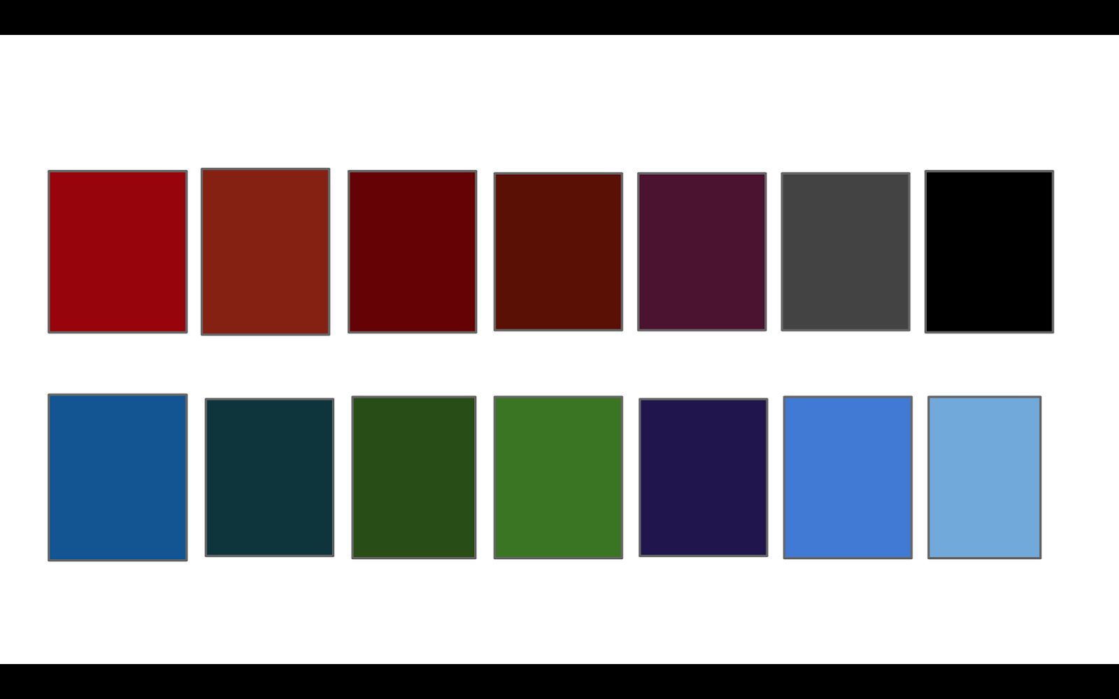
These are a range of colours that are used throughout the series. I used different shades for reds as there is a lot of surgical and torturous scenes in the season. The greys and blacks are used because the asylum is very dark and gloomy, there isn't a lot of bright colours used. The blues are used for the patients uniforms and the greens are used for the surrounding forest/wood area around the asylum. 

Saul Bass Horror Posters

M

Night of the living dead-  This poster only uses colours, cream, purple and black. Used cream so that it doesn't contrast on the other darker colours as much as a white and gives a more of a murky and dark effect. The lines across the page is meant to look like a barricade and has deformed hands coming through, suggests the zombies or 'the living dead' are breaking through, gives away some of the plot of the film but not all of it, leaves mystery as to the rest of the plot.

The shining- This is the Saul Bass Poster for the horror film, The Shining. Bright colours, with a face in the letters, the bright yellow contrasts against the black, making each feature bold. I like how the face is made out of tiny dots and like the depth this effect gives. This poster includes a picture but I like how it doesn't give away the plot like some film posters do.
 
War of the worlds- no writing apart from the name of the film, doesn't say any of the actors names. White alien contrasts against the dark and dull city background. Dark colours used for the background gives an industrial tone. The white alien shows that there is an invasion and suggests that it doesn't belong as the colours don't match. 

The thing- used light colours as it's set in a snowy place, unusual to see such a bright colour used in a horror poster. The horror part of the poster would be the 'thing' which is black, the onu dark thing on the poster showing that he's evil. This is very detailed for a Saul Bass style.

Dracula- a lot of detail for a Saul Bass poster,l. Used white for parts which the light is shining on, red for midtones and black for shadows. Layering effect to show light. Really like this effect and the use of a bright and bold colour works well. Unusual style don't for a Saul Bass poster.

American horror story- shows part of the actual plot, but doesn't give away too much, just little hints. Only uses red against white. Red to show horror, blood and fear where as white shoes pure and peace. Contrasting ideas as well as colour. Manages to fill the entire page without looking too cluttered. 

Horror posters


White nun, white is a pure and holy colour which would be suitable for a nun. The nun is expressionless and has black bleeding eyes, adds a sinister look to the nun. Suggests that the nun becomes corrupt, which does happen in the series but it doesn't give away too much of the plot. The black blood heavily contrasts against the white nun suggests the darkness may be taking her over.

Dead silence- dark colours used like a typical horror poster. Really like the use of the tag line and the pose the dummy is in, go together well and it's as if the dummy is the one saying the tag line. Uses a doll and implies what the film is about but doesn't give away too much. 

Maniac- no photo used just a drawing gives away what happens in the film but as it happens all the way though it doesn't spoil the plot of the film. Really like the way the name of the film is laid out and the bright red contrasting on the black box. Very graphic content, not suitable to hang every where as it would scare younger ages. Not the best for advertisement.

Nightmare on elm street- very dark image hard to see what it actually is, this is done so you don't see the character properly and still leaves mystery. Really like the highlight and shine added to the blade. Draws your attention, showing that he's dangerous. Think the use of the tag line as well as the image that still leaves mystery have been used so when you think your own worst nightmare you can imagine him being that character and it will scare the audience. 

The possession- very dark and dull colours used. Photo of a girl with something coming out of her mouth and attacking. The image and the name give away what is going to happen in the film. We are made to believe this girl gets possessed. Like the way the font is used to contrast on the dull image and like the glowy, scratched effect- something used on a lot of posters.